
Creating accessible Microsoft Word documents
Welcoming all readers is not that hard.
Accessibility is not just for websites and apps. Marketers, writers, and designers spend most of their time creating and living inside Microsoft Word and PowerPoint during the campaign development process. These campaign artifacts—while not always public facing—should strive to be as accessible as possible.
In this guide, we showcase five ways to make your Microsoft Word documents more accessible using Word’s built in tools.
1. Structuring documents
Pre-built styles
Crafting a proper document structure is vitally important for accessibility. Writers always have structure top of mind, but many don’t take advantage of the relevant tools. The toolbar at the top of every Word document has a selection of pre-built styles including, Normal, Heading 1, Heading 2, Title, Subtitle, etc.

Using these not only adds visual structure and styling differences to your document for sighted readers, but also adds semantic and navigable structure for people who use screen readers.
Using the pre-built styles will automatically build out the document outline for you—allowing all users to quickly navigate around your document using the navigation sidebar.
Direct formatting of headlines
Avoid using ‘direct formatting’, e.g., changing the font size and colour to differentiate your headings. The underlying code of the document will not recognise this structurally as a heading and will present it as body copy to screen readers. Use the pre-built styles instead.

Structure
Do not use text boxes or tables as screen readers will often ignore text boxes or read their contents out of sync with the rest of the content. Use Word’s built-in columns and section breaks tools to create additional structure over tables, as screen readers have difficulty with tables—more on that below.
2. Styling documents
Font sizes
Start at 14pt for body copy if your document is not going to be printed, 11pt otherwise. 14pt is large, but colleagues reading on small laptops or mobile will thank you for not having to zoom in and scroll around your document. 14pt is the base point size for accessibility standards.
Line spacing
The space between lines should be comfortably open, but not so open that each line looks like a new paragraph. You can control this universally for your document by editing the ‘normal’ pre-built style. Change it to 1.5 line spacing.
Colour
Bright colours have a low contrast ratio on white backgrounds, making text difficult to read. Use darker colours, pure black or very dark grey for your body copy. Headings, when using the pre-built styles, are larger, so your colour choice is a little less impacted here.
You can test your document colours directly in Word itself using the accessibility checker—more on that below. If you find that you are getting colour warnings, you can modify the pre-built styles by right clicking on them in the tool bar and selecting ‘modify’.
3. Writing for comprehension
The built in ‘Editor’ sidebar will continuously check your document as you write and provide you with an Editor Score. The closer to 100% the better your document is. It covers the expected—spelling and grammar—but also provides guidance on clarity, conciseness, and vocabulary used.
You can also get readability scores, using commonly accepted methodologies, like the Flesch-Kincaid Grade level. You can learn more about Flesch-Kincaid readability tests here, but the goal is to have a low grade level which means your document is more likely to be understood by a wider audience.
Avoid jargon and break down complex concepts into simpler ones.
4. Tables, charts, and imagery
Tables
Screen readers don’t understand tables very well, they read them from left to right, then top to bottom. Assess your data and strip it back to just what you really need to show or split your data across multiple tables.
Always define a table header. Select the first row in the table and check the ‘table header’ check box from the ‘Table Design’ tab in the toolbar.
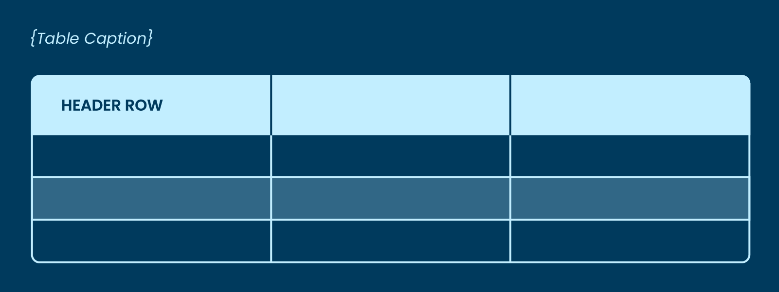
Don’t merge cells. It is better to sacrifice some visual simplicity and repeat information.
Always include a caption for your table to describe its purpose. Select the whole table, and then click ‘Insert Caption’ from the ‘Insert’ tab in the toolbar and enter the caption text in the dialog box that appears.
Adding alternative or ‘alt’ text will help you describe the information or trend being presented in the table. This information should be different to the table caption you added so you are not doubling up.
Charts
Think of charts as images, they are cut off from screen readers without alt text. Like tables, charts and diagrams should be kept simple, think about what you really need to show.
Include captions and alt text descriptions here too. Your alt text, should not repeat the data in a bar chart, however, explain the observable trend presented by the chart.
Imagery
Microsoft Word automatically generates alt text for any image you import into your document, which is great, but most of the time it doesn’t hit the mark. You can use these as a starting point, but you should always check them and rewrite them so that readers that rely on them have a better understanding of the image.
5. Testing your document
Testing can be done in-document. You should be testing as you go if you are co-authoring with colleagues, so that everyone is having the best possible experience.
To test your document, click on the ‘Review’ tab in the toolbar, and click the ‘Check Accessibility’ button. This will bring up the accessibility side bar.
The accessibility check results are broken down into error and warnings. Word provides you with a description of the error, why it should be fixed, and how to fix it which is great for building future habits.
While accessibility is a deliberate practice for each document you create, it doesn’t have to be a time-consuming setup task each time. Styling and document structure can be taken care of for you with the right Word template.
As for the rest—alt tags, table and chart design, and accessible writing—these are all manual processes that Word cannot automate for you. You will have to build them into your practice and document building approach, but they will become habit over time.
We can help you and your team get started on the journey to more accessible documents. Give us a shout.