


Ugh, I hate PowerPoint!


You, and almost everyone else, right? But, this is a tool with immense power (pun intended). PowerPoint, like Google Slides, or Apple Keynote is the vehicle, the messenger—it helps you project your voice and make your point. What could be more important?
We are firmly in the “I heart PowerPoint” camp. We use it every day, creating moments of wonder for our clients.
Design Levels
1-3 DAYS
Tidy Up / Polish
Your deck needs a bit of sprucing up, we’ve got your back.
We’ll take care of:
Consistency in fonts, colours, and element alignment across every slide.
Making sure everything is aligned to your brand guidelines.
Getting it ready to seamlessly go when it comes time to pressing play.
3-5 DAYS
Design
Need more than just a spruce up? Ok, sure, we’ll pop on our black designer turtlenecks and help you with:
Tidy up, plus—
Recreating all your diagrams and charts to better support your message visually.
Revitalise your lists with icons for better glanceability.
Adding imagery throughout for greater visual storytelling—an image really is worth a thousand words.
Completely redesigning your key moment slide/s so your audience will want to take a photo of them for inspiration as well as their content.
10-15 DAYS
Transform
Ok, wow. Deck. Must. Be. Reborn. Got it.
We’ll do this:
Design, plus—
A concept overhaul, two options aligned to the story you are trying to tell.
Rework (a polite way of saying, “severely cut down the content”) the content with you to get to the heart of the story. Do you really need to say all that?
See where slides can be replaced by imagery or video with a single statement, because the slides support you, not the other way around.
Reimagine diagrams or charts as infographics for greater visual support.
A MONTH
PRESMO
What? Yeah, it’s a thing we termed. It’s a presentation combined with motion graphics. Pretty pretty pretty cool.
You get:
Everything already mentioned, plus—
Complex animation and transitions that hit with and support your story beats and key moments.
Custom motion graphic elements to help support and enhance animation effects already built into tools like PowerPoint.

Need some urgent help with a presentation? Contact us today: studio@designlogic.com.au.
What does a transformation look like?
It can be a bit of a wow moment when you unveil a transformed deck for the first time.
The original deck was a sea of dark reds and black and a mish-mash of stock imagery styles. The story (masked for confidentiality in these images) was about a ‘freeing of perceptions’ and ‘increased agility’ as a result of implementing a new business strategy approach. We took that literally and filled the slides with white space and glorious movement. Subtlety was key when selecting imagery so the client’s brand colours stood out for key messages and data points throughout the deck.
Presentation styles
It’s all about the end-goal and how many people you are presenting to. We see your slides as the key to success. Presentations can sell products, persuade decision makers, explain data, or effectively train teams, when we focus on what you want to achieve.
EMAIL IT TO ME
Inform
More reader than presenter.
Offering detailers
White papers
Survey results
Research results
Analytics dashboard
Design style: report
Content and detail: as much content per slide as needed, but not crowed. Another slide is OK.
1:1
Introduce
Quite often a reading / presenting hybrid, suitable for a subject deep dive.
Overviews
Demos
Training
Design style: brochure
Content and detail: less content per slide than a report, but still fuller slides.
1:FEW
Sell
The slides are the backup dancer, not the lead singer.
Pitches
Sales tools
Bids and proposals
Design style: brochure-lite
Content and detail: lighter slides.
1:MANY
Inspire
The spotlight is on you.
Keynotes
Webinars
Design style: supportive
Content and detail: even lighter slides, or no slides at all.
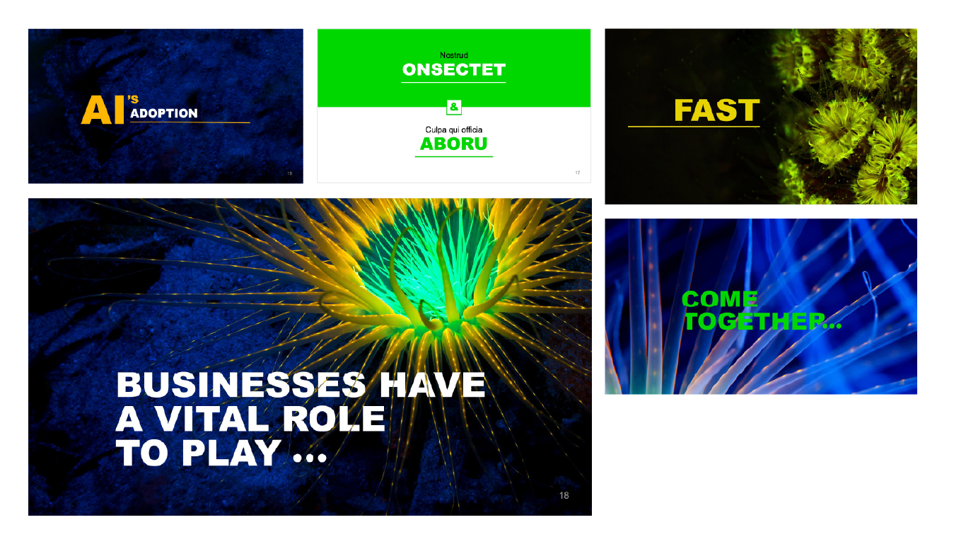
How do you introduce a potential $400 Billion impact to a national economy?

Starting with a big number is good! Then work backwards to prove that number, with logical, pragmatic, and practical steps to achieve that number. Done!
Despite the increase in the public's perception of what AI is, it's still difficult to articulate visually without resorting to bad stock photography or robots. We took a different root, using abstract macro photography of deep sea flora as a metaphor for positioning AI as an other worldly, but still known feature of the world.

Preparing content
A lot can be conveyed by body language or facial expressions alone. So, consider the balance between what is shown and what is spoken.
Streamlining
Got 100 slides but only want 25? We can do that.
This is a big exercise, so we start off with a call to go through the deck in detail to understand what should remain and what might be headed to the slide graveyard.
Organising
That same 100 slides may need to stay as 100 slides but could be better served with some structure around them.
We can introduce and write section dividers, add an interactive table of contents and navigation throughout the deck, and organise everything in between so that each section contains its own story and flows into the next smoothly.
Talk-track writing
Once we’ve taken care of streamlining and organising, we can then look at what content remains on the slide itself and assess what needs to be seen vs. heard, converting necessary-but-not-vital-to-be-seen content into a talk track for the presenter.
Then, it’s off to design.
Script writing
We can work with you or your stakeholder to understand everything they need to say and write their script for them, ready to be printed onto tiny little cards the size of your palm, or better yet, to be memorised.
Organising and presenting 90+ offerings consistently
We helped a client articulate the breadth and depth of their offering to their team of 1,100 consultants. This offering playbook, created in PowerPoint, removed hundreds of individual offering spreadsheets, documents, and presentations stored over different locations with differing levels of detail and design maturity.
The resulting playbook offered team members an intuitive way to start their journey, by industry or corporate function, from there they could select an offering, understand it's benefits, where it had been used before and get in touch with the relevant offering owner. Check out a snap shot below.

From whiteboard sketch to detailed wireframe, the information architecture phase is key when planning a big document.

A simple elegant cover design. It really is what it says on the tin.

Multiple ways of navigating the offerings were included. Users could search by relevant industry or start with a corporate function.
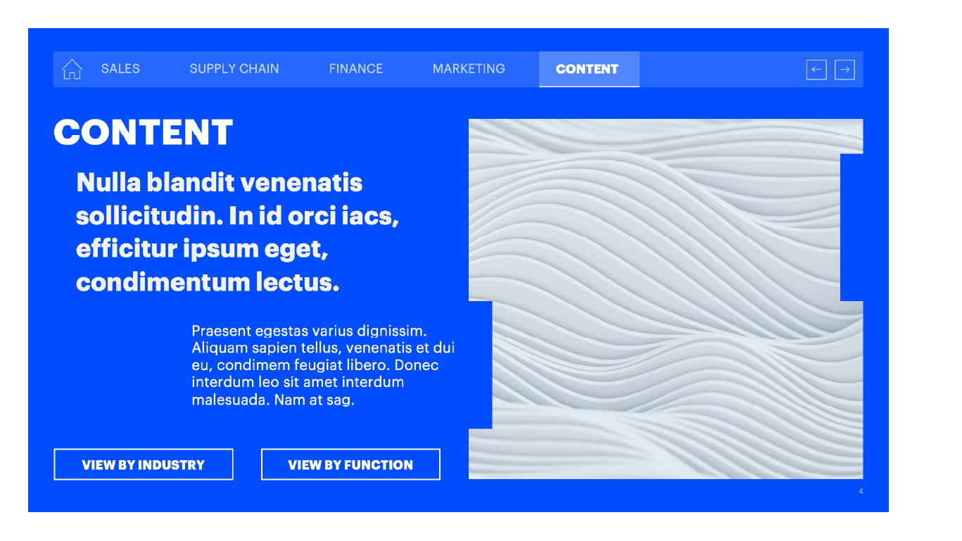
Section dividers offered a 'break' from the information, while introducing the selected topic. Users were able to navigate back and forth via the persistent top navigation bar.
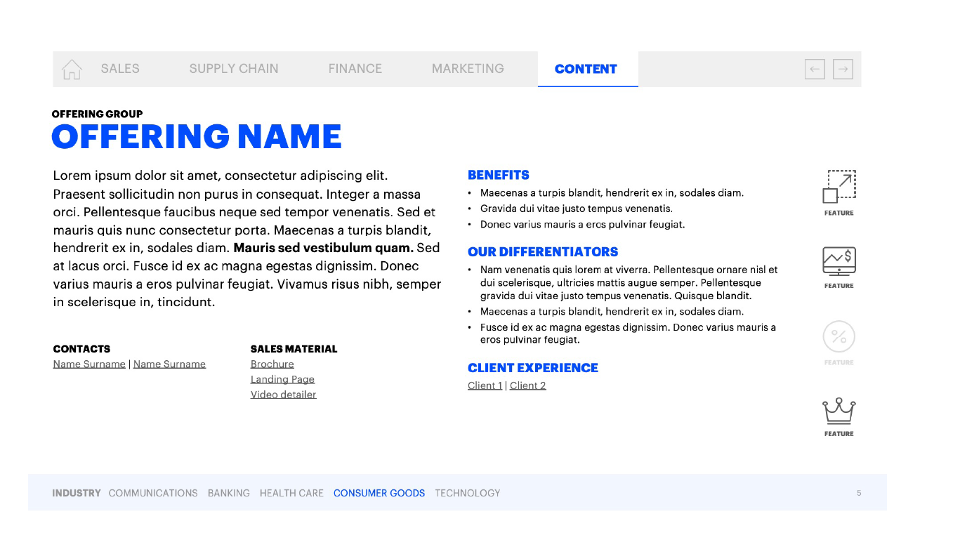
At the end of a flow, a user would reach a particular offering detailer slide. From here, they could learn about the offering, its use cases, where it had been used previously with other clients, and get in touch with offering owners.
Template types
Scaling good design and content best practices can be difficult when not everyone is on board. This is where a PowerPoint template make sense.
1 WEEK
The Basic
This is your typical template, with the core master slides designed to fit your brand, its colours and typography. We also customise cover and divider slides, so that your first impression lasts.
2 WEEKS
The Extended
Expands upon the basic template with additional slide designs created to match the most common types of content you present across your business. We also include a brand-matched image and icon library so that everyone in your business is creating on-brand decks from the get-go.
4-8 WEEKS
The Toolkit
This one is for the presentation die-hards. The toolkit is exactly what you think it is, a large set of resources tailored to your preferred presentation software. It’s everything you get in the extended template, ramped up to 11. More base slides and more custom slide types, like charts, diagrams, maps, journey flows, etc., more imagery, more icons. We even create ‘canned’ slides for content that is regularly presented across the business so that everyone is consistent in their message.
What does a toolkit look like?
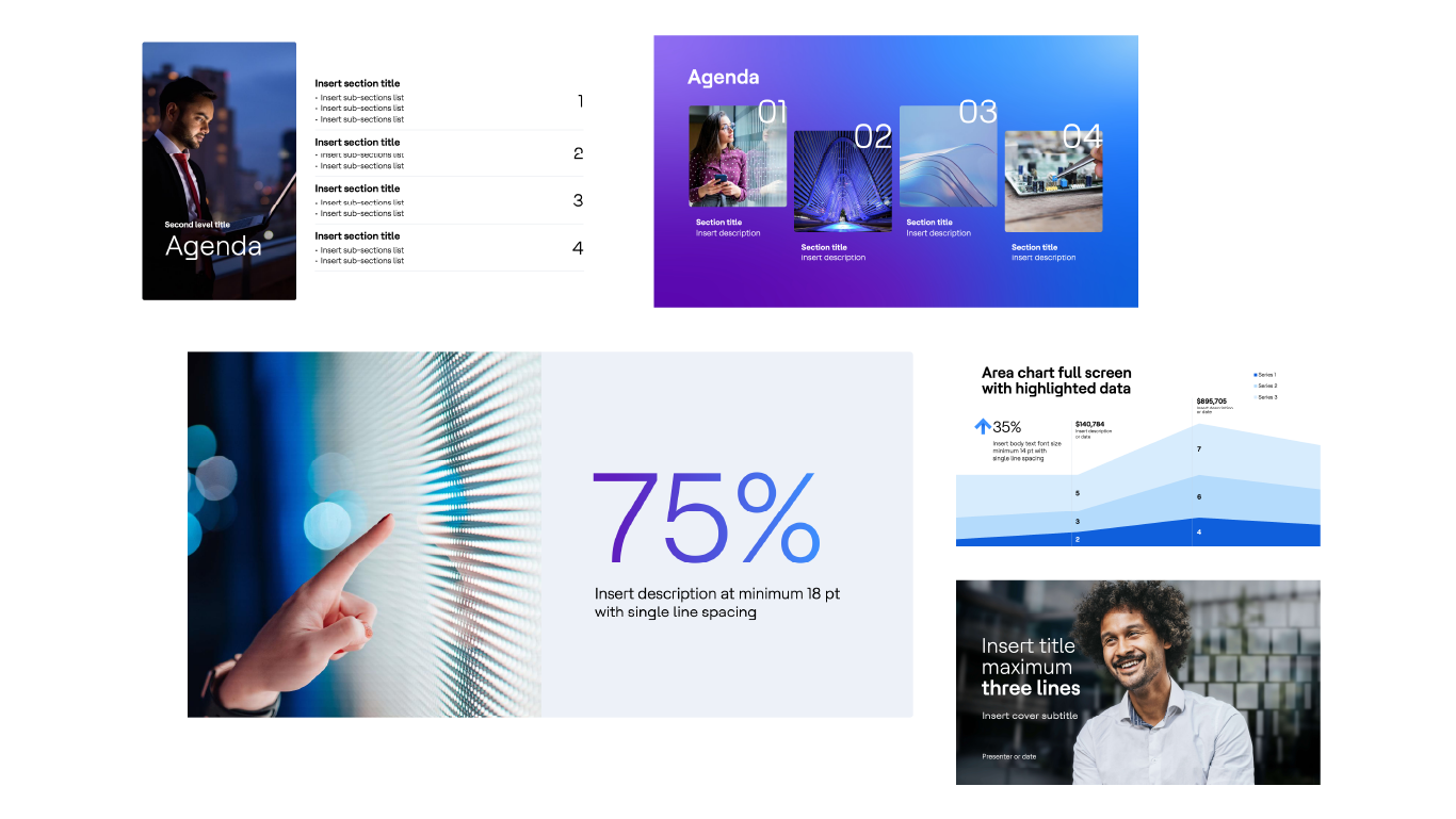


It looks like professionally designed, creative freedom at your finger tips. This toolkit, for a global technology services company contains over 200 custom design slides and 100 icons, ready for any story to be told. We included beautiful custom designed and editable charts and diagrams, on-message brand imagery, and plenty of layout options allowing them to cover all of their presentation needs.
Fall in love with PowerPoint again!
Opening a presentation file and getting stuck in doesn’t have to be a dread if you are set up for success with a good template, your focus is on the end-goal, and the balance between what is seen and what is heard is continually refined—"a thousand no’s for every yes” to quote the design leaders over at Apple.
We are, of course here for it all—irrespective of where you are on your journey to falling in love with the power of presentations. Drop us a line. We’d love to chat.